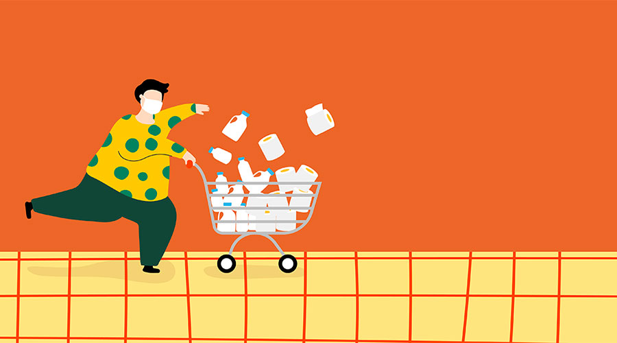
How to Reduce Shopping Cart Abandonment Through Design
Originally published: January 13, 2024 06:37:29 PM, updated: January 13, 2024 06:47:44 PM
It is a well-known fact among e-commerce website designers that nearly 70% of online shoppers abandon their carts. This daunting figure is perhaps less surprising when you consider the amount of competition on the web and the innumerable distractions that can pull a person away from online shopping.
Making note of this fact isn’t to discourage any efforts on that front but to let you know these numbers are to be expected if you’ve seen similar results. We also want to provide reassurance that there are practical solutions to get those percentages moving in a favorable direction as your business expands.
In this article, we seek to identify the main causes of shopping cart abandonment and disclose some solutions that can help bring that percentage down. We focus specifically on the design aspect of the shopping cart page and its related imagery.
Top reasons potential customers abandon shopping carts
The best preliminary course of action to prevent shopping cart abandonment is to figure out the cause; otherwise, it will be challenging to determine which solution applies. Below, we’ve listed the top reasons why shoppers abandon online carts.
Extra costs are applied to the cart
Many online shoppers abandon their carts because of unsuspected costs added on during the checkout page. “Extra” can be any cost the site designers failed to clarify before the last page, such as higher shipping costs to certain regions or transaction fees.
Either way, informing your customers about fees transparently before the cart isn’t just preventing abandonment; it’s building the kind of trust that brings consumers to the shopping cart in the first place.
Too many information requirements
For us to conduct business, consumer information is always necessary; asking for too much information upfront slows it down.
Sellers often make the mistake of building future leads at the cost of current success. We recommend focusing on the sale and then leading your consumers to sign-up opportunities on the confirmation page.
Unfavorable user interface
Websites use different methods to lead the consumer and make finding the next step convenient. For e-commerce, a UI that’s hard to navigate is more than just an eyesore; it’s an obstacle between them and their purchase.
Even if the website’s digital catalog provided useful breadcrumbs, there’s bound to be some browsing fatigue if the user has arrived at this point. This means the cart page should focus on presenting the most useful information in plain sight. Giving them a heads-up about related items is good practice, as long as these advertisements aren’t intruding on the transaction.
Bugs and performance issues
Customers will almost abandon online shopping carts if the website isn’t responding as it should. Worse, customers who experience technical issues at this stage are unlikely to revisit your website any time soon, if ever.
Extra features and aesthetic embellishments are a great way to separate your brand from the competition--as long as they work. And while fear of bugs shouldn’t stop businesses from trying to innovate, stability is paramount when money is directly involved.
Poor shipping options

As you know, the cost of shipping can make or break an online business. Offering it for free means you’re covering costs and making up for it in volume, but most companies outside of Amazon can’t afford this perk.
Consumers may also abandon carts if the shipping options take too long. Small businesses are pragmatic in using the most dependable means to deliver their goods, but customers tend to leave their carts when they need or want something tomorrow, and your shipping takes at least a week.
Lack of security
Most online shoppers are savvy enough to look for specific financial data protection symbols on their purchases. Even less tech-savvy users have been conditioned to look for certain logos before spending money online.
We can assume you’ve enabled some form of fraud and data security on all transactions. Just ensure the person signing over their credit card information knows it, using visible logos and accessible information.
Unclear refund options
Some customers expect to see clear refund policies before the final transaction and will lose faith in the process if it seems like the site is hiding it. Even if your company doesn’t offer refunds, it’s better to disclose this fact before this point.
An interactive tooltip is a good way to make the refund policy available near the final steps. While this group is the minority among the reasons for shopping cart abandonment, fixing it is generally a matter of providing a clear link to a ‘refund policy’ landing page.
Ways to reduce online shopping cart abandonment
Now that we’ve covered the ways e-commerce websites lose potential customers through design mistakes, we can focus on fixing these problems. Below, you’ll find a list of the best ways to reduce shopping cart abandonment.
Discovery
In technical terms, discovery represents your business’s ability to ‘discover’ information that is vital to success. With shopping cart abandonment, this means tracking the behaviors of consumers to ascertain why they left.
Discovery can be as simple as noting which part of the process has the highest abandonment rate, or it can involve deep analytics about consumer’s tendencies to interact with different parts of your website.
We put this one first on the list of fixes because analytics is critical to approaching problems directly instead of throwing money at the problem. With intel on how your shopping cart is falling short, you can direct your efforts toward targeted audiences and changes.
Responsive design

Responsive web design is so ubiquitous that the concept is no longer distinct from general web design in the eyes of designers. Most basic website-building platforms use responsive design by default, but this is meant to address shopping carts that still reside in basic HTML formats.
For those unfamiliar, responsive design is the practice of designing web pages so they can be viewed on any screen. Its evolution came about with the advent of phones and tablets, as web developers needed to account for countless screen dimensions.
For a blog or a news site, a standard format with a few accommodations could be acceptable, but online shoppers require a more streamlined experience leading up to the finish line. Examining products and pricing without technical hindrances should be a baseline for any shopping cart page.
Saved cart features
One simple measure you can use to prevent customers from abandoning their shopping carts on your website is to let them save their carts until a later time. Making the immediate sale is always the goal, but playing the long game is how you earn repeat customers.
A saved cart feature can help you retain customers who simply got pulled away when they were about to click the ‘buy‘ button by circumstance. Maybe they accidentally clicked out the browser or got a phone call at an unfortunate moment.
On the one hand, a saved cart is a lead that can become a purchase in the future, especially since all their items are in the same place they left them. On the other hand, most customers will appreciate the consideration, which makes them more inclined to return to the cart.
Efficient buying aesthetics
Web design will always be focused on achieving a certain aesthetic that expresses the subject’s intent to the reader. As we mentioned in the challenges above, the primary purpose of a shopping cart page should be to close the deal without hindrance and to provide an air of comfort.
The use of white space makes the important items stand out more, and it’s generally easier on the eyes. Consider that each site synonymous with online shopping uses a white motif with no more than two branding colors.
Highlight the confirmation button in a way that makes it impossible to miss and hard not to press. Using white space properly means just a bit of color is necessary to make it stand out. Green is the default color simply because it encourages the user to ‘go,’ while red and yellow are inadvisable for similar reasons.
The bottom line
Some online retailers consider the job complete once the buyer arrives, easing off the bells and whistles. Others might see a chance to engage in future business since the visitor has already clarified their interest.
Both approaches have their merits. In terms of design, however, the goal of an online shopping cart page should always be to lead the customer through the narrow part of the sales funnel as efficiently as possible.
Finding experts to optimize your shopping cart design is a must if you want to reduce cart abandonment. Consider this article to learn how much it costs to outsource software development.
Join over 145,000 SEO and Google Ads experts. We provide a community to help you engage and learn from industry experts and influencers. Join Now
World-class digital workplace software for a seamless employee experience, whether you have 10 or 10,000 employees.